 WEBSITE DESIGN
 DIGITAL MARKETING
 SEO Services
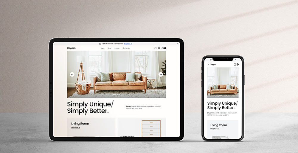
If your website is not compatible across mobile devices, you’re losing customers.
Today’s users are time poor, they want to be able to access a website to buy, browse or book all from their phones.
Your website is more than just an online presence – it’s often the first impression potential customers have of your brand. Yet, whilst having a range of users using their mobile phones or tablet devices, many businesses are still operating with a non-responsive website design. If your site isn’t adapting to all different device screen sizes, you’re falling behind and most likely losing valuable traffic, and more importantly, qualifying your leads.
Over 60% of website traffic now comes from mobile devices, yet many businesses are focusing their web design on desktop versions that’s frustrating users and killing conversions. If your site is slow in speed, doesn’t load correctly or isn’t user-friendly on mobile devices, your users will bounce and move onto your competitor’s websites.
Here’s why a non-responsive website could silently be killing your business – and how making the switch can turn things around for your potential visitors.
Why a Non Mobile Friendly Design is Costing You
You might not see it first hand, but a non-mobile friendly website is creating missed opportunities when a visitor jumps on your site. Here is what’s costing you:
Poor User Experience
Imagine visiting a website on your phone and having to pinch and zoom endlessly just to read a paragraph or click on a call-to-action button. It’s quite frustrating, right? That’s exactly how the visitor would feel when visiting your website that’s non-responsive.
Responsive design ensures that your website content is automatically adjusted to fit your device screens – whether it’s a desktop, mobile or tablet device. Without it, users are not impressed at first glance, they feel like navigating the site is clunky and inconvenient, which drives them away in seconds. According to Google, 61% of users are unlikely to return to a mobile site they had trouble accessing, and 40% visit a competitor’s site instead.
To sum it up, a bad mobile experience = fewer clicks on your website.
High Bounce Rates Impact Your Search Rankings
Google’s algorithm doesn’t just look at your keywords inside your copy, it pays clear attention to how people are interacting with your site. High bounce rates – when users leave your site after viewing one page – signals to search engines like Google that your content isn’t engaging enough or useful to visitors. Often, this is due to poor navigation and a non-responsive website design.
When users click on your link in search results but quickly jump off your website it’s mostly due to a poor viewing experience, it sends a red flag. Over time, if this behaviour is repetitive it can hurt your SEO rankings, making it even harder for potential visitors to find you in search results. Fewer visits means fewer opportunities to convert those clicks into customers.
Missed Opportunities with Mobile-First Indexing
Google now uses what’s called mobile-first indexing, which means it primarily focuses on mobile versions of your website when determining how to rank your site in search results. If your site isn’t responsive – you’re at a disadvantage.
A responsive website doesn’t just improve the mobile experience, it ensures that your content is accessible and consistent across all mobile devices. That way, you won’t miss out on important indexing opportunities that will drive organic traffic and clicks to your website.
Low Conversion Rates
Even if users are visiting your non-responsive website, the likelihood of converting them into paying customers drops significantly – whether that’s by making a phone call, submitting a form or making a purchase. Why? Because when a website adds inconvenience to the interface experience it adds confusion and delays to the customer browsing journey.
Responsive designs should streamline a user’s experience on your website, removing any hurdles and making it easier for visitors to take immediate action. This includes having clear call-to-action buttons, readable text, and easy navigation on any device – this all contributes to higher conversion rates. Statistics show that responsive websites have a 10-15% increase in conversion rates compared to non-responsive sites.
You’re Losing Trust and Gaining Negative Brand Perception
Consumers associate the quality of a website with the brand of the business. A site that feels outdated on a mobile reflects negativity on your business. Users will often judge poor UX with unprofessionalism or lack of credibility.
Seeing your site on a sleek, responsive design communicates to the user that your brand is modern, credible, and creates a positive impression for your brand. First impressions matter, and a good one can mean the difference between a visitor browsing and clicking through your website or clicking away.
Conclusion
Your website might look impressive on a desktop, but if it’s not serving your users on a mobile, you’re losing out on what matters most – getting more customers. A non-mobile design doesn’t just frustrate users and inconvenience them, it costs you clicks, leads and long-term business growth.
At Design Point Digital, a web design company in Melbourne, we assist with transforming your website into a high-converting sales machine. This includes having a mobile-optimised online presence. If you feel like your site is letting your brand down or it’s low in conversions, let’s have a chat.
Contact us today to build a website that not only impresses your users on mobile devices but can start converting your visitors into customers.