Just because a website looks clean and professional, it doesn’t mean it converts visitors into customers. The same goes for SEO; a well-optimized page won’t necessarily lead to more sales and engagement.
User experience (UX) and user interface (UI) can make or break your success online. These practices help optimize the experience that visitors have on your site, which in turn, will lower your bounce rate and improve your ROI.
UX designers do more than just create usable web pages; they focus on all aspects of the user experience, such as accessibility, efficiency, pleasure, and ease of use. These elements lead to a seamless, fluid interaction between users and your interface.
In other words, UX design is user-centered. Every colour, line, and page element is created with the end user in mind. So, how can you make sure your site provides a flawless user experience? Start by implementing these UX website design tips:
Focus on Your Audience
Whether you’re optimizing your site or creating a new one, do it with your audience in mind. Everything from the text and layout to graphics should appeal to the end user.
In this hypercompetitive era, over 70 percent of customers expect brands to offer personalization as a standard. They want to be heard, valued, and understood. A generic website will get lost in the crowd and fail to provide the desired outcome.
Make Your Content Readable
According to the latest research, the average person has an attention span of eight seconds. In fact, even goldfish can stay focused for a longer time.
Digitalisation has changed the way people process information. Internet users no longer read large blocks of text or spend hours trying to find what they need online. Therefore, your content needs to be readable and to the point.
Work with a web design agency who knows how to tweak your copy, visuals, and page elements so that they’re easy to scan. Get rid of the fluff and clutter and keep your content relevant. Make sure your text and infographics convey your message in a manner that’s both relatable and accessible.

Use Colours to Evoke Emotions
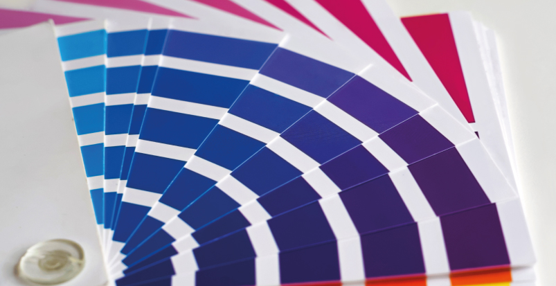
The colours used on your website have a direct impact on user experience. Bing, for instance, experienced an $80 million increase in annual revenue after choosing a specific blue over other hues.
Good web design relies heavily on colour psychology. Colours have the power to evoke emotions and drive specific actions. White, for example, is linked to simplicity, minimalism, and purity. Black is associated with glamour, sophistication, and substance. The colour pink and femininity go hand in hand.
Depending on your goals, choose a dominant colour for your brand and website. Next, select a background colour that fits into the overall theme. Mix complementary shades to create a stunning colour scheme that aligns with your mission and product offering.
Create a Visual Hierarchy
Customers are more likely to notice elements near the top of the page. That’s why successful copywriters spend hours creating eye-catching headlines. The same happens in grocery stores; the most expensive products are placed at eye level, while the cheapest or less popular ones sit at the bottom.
These principles apply to website design as well. For a seamless user experience and better conversions, it’s necessary to create a visual hierarchy. Use colours, spacing, contrast, and other elements to organize and prioritize your content, whether it’s text or images.
For example, using a larger font is one of the easiest ways to highlight information. A bright splash of colour, such as orange or red, will draw attention instantly. Furthermore, you can create high or low contrast in a design by using muted or bright colours.
UX design is both art and science. When done right, it can dramatically improve how a brand engages with its audience and shapes user experience. A skilled web designer can bring your ideas to life while increasing your ROI and conversion rate. Take the time to find someone who understands your vision and can turn it into reality.


