 WEBSITE DESIGN
 DIGITAL MARKETING
 SEO Services
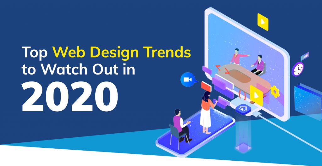
With digitisation having taken over the world, everything is on the web! In order to market yourself or your brand to the mass market, you need to have your website design on point.
Keeping current trends in mind and optimising your website will take you and your product a long way. Therefore, keep the following points in mind to be able to effectively achieve this:
Dark Mode
The dark mode is considered as the most impactful web layout. Highly in trend currently, It enables website elements and design intricacies to stand out. Therefore, much more noticeable. It is easy on the eyes and helps conserve power (battery).
However, an important point to be kept in mind is the usage of contrasting colours for design elements. This is the only way they will stand out. There has been an increase in the use of colours that attract attention and make design elements stand out, like neon etc.
3D Design
Interactive content will bring you much more engagement. Having a 3D design enables the user to deeply immerse into your website landing page. 3D graphics offer a much better user experience.
Using 3D elements may be heavy, therefore evaluate the format of 3D graphics that you are adding. For instance, JPEG format is not heavy, however using MP4 or GIF may be heavy formats. 3D technology is blurring the lines between virtual and reality and is going to be a thriving trend in 2020.
Integrating ChatBots
Users have questions. A user may not essentially understand the language of your website or a new user may need help. Planting chatbots helps you ease a user into your website.
It is a software that interacts with a user that comes to your website in lieu of a real person. It is also essential to use chatbots for global customers who might be functioning in a different time zone.
Illustrations
On your website, illustrations will give the much desired animated feel. Everyone uses pictures, give your website an exclusive feel. From a user engagement perspective, illustrations work really well. They are more detailed and grab the users attention immediately.
When you use a GIF format illustration, you can use your brand colours and give it the detailed feel of your brand. This helps the user in being able to connect more with the brand.
Overlapping Design Elements
Flat designs are not very eye-catching. Design aesthetic has evolved and is inclining more towards quirkier and fun elements. Use of broken grids and asymmetrical designs and overlapping elements is looked upon as off-beat. Since most digital content on the web is consumed by millennials it is always safer to keep web designs up to date with trends.
However, the webpage layout has to be in keeping with the mobile user interface as well. If the design is not executed well, it can be confusing when viewed on the mobile.
Background Video
Nothing talks to users like a video embed or a video background on your website. One can use videos in various formats – animated or real-life. It will bring your website to life and will increase the stickiness of the user.
A background video helps decrease the bounce-rate (how fast a user leaves the webpage) of your website. It ensures that the user stays on the website till the end of the video. Music or an informative sound can be added to the video to engage further with the user.
However, it is advised that such functionalities be tested on all devices before being applied to the website.
AMP Pages
The millennial audience that the digital space caters to, has a rather limited attention span. Websites need to be optimised enough to have the minimum page load time possible. Google introduced AMP pages sometime back.
AMP pages are mainly meant for the mobile interface. They help decrease the page load time and hence increase the number of visitors on your website or website traffic.
This is the most highly recommended criteria by Google to make your website rank on SERP or for it to be optimally SEO enhanced. Enforcing AMP will most certainly be a top trend this coming year.
Every website has different requirements. The layout and planning of the website depends on the product in question. For instance, the layout of a personal blog will be radically different from the layout of an ecommerce website.
An ecommerce website needs to be a lot more user friendly as compared with a blog. It needs to have an easy navigation path for users to be able to reach the end of their transaction.
While web design appears to be fun and frivolous. It requires technical know-how. Therefore, it is essential to take advice from a web design and digital agency. A 360 degree approach towards building a website would enhance the reach and eventual traffic on your website. Keep in mind SEO parameters and ensure SEO optimisation for the website with the advice of an SEO expert.
Design Point can help you with improving your online presence. Call us on 03 9923 2712 or send a message.