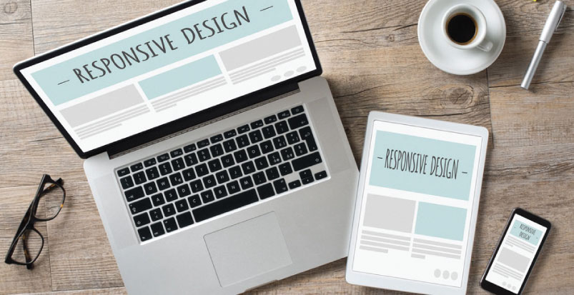
Want your web design to look attractive, no matter the mobile device and size of the screen? Then responsive web design is the way to go. When you take the time to look around you, you’ll see that we are always with mobile devices on our hands. Either a smartphone or a tablet, you can be at the coffee shop, at the grocery store, at home, waiting for a doctor’s appointment, or whatever, and you’re always looking for information. It is essential to have a business website that is mobile friendly so that your clients and target audience can easily browse your information regardless of what type of mobile device they are using. The increase that we have been noticing in the mobile visitors opens the door to more sales. So, it’s time to look at your website and how it displays on these devices. If your fonts are so small that your visitors need to keep zooming in and out to be able to see the information you have there, you can be sure they won’t return ever again. And this is why you absolutely need a responsive website, where all the pages will immediately adjust depending on the device you’re using. There’s no point in hiring a web designer to create you a mobile version of your website. This usually only brings headaches. The best solution is, in fact, to hire a website designer in Melbourne who is able to create you a responsive web design. If you’re not yet totally convinced that this is the way to go, check out the top 4 reasons that explain, in more detail, why you need a responsive website design:
#1: Mobile Traffic Is Increasing:
 In 2016, almost 60% of all website traffic came from mobile device users, and 80% out of these visitors regularly uses their smartphones to shop online. So, as you can see, you’re missing an important piece of the pie when you don’t have a responsive website.
#2: Rank Higher on Google:
 One of the factors that Google takes into account to rank your website is whether it’s responsive or not. This shouldn’t be much of a surprise considering Google and every other search engines try to provide the websites that provide a better user experience to visitors. So, make sure that you check out the best web design company that will offer a website with great mobile user experience.
#3: Only One Website To Manage:
 If in the old days you needed to have a regular website and a mobile version of that same website, you would have to spend double of the time and money to work on both. However, now, you only need to have one. This means more time and money to make your website a success.
#4: Be The Future, Not The Past:
 When most people visit a website that still isn’t responsive, they tend to click return and visit another one. If the website owners didn’t even bother to change their outdated website, why should they bother in adding valuable content or have great products to sell? This is exactly what visitors think. As you can see, you have no reason to stay with an outdated website. It won’t bring you any sales and your small number of visitors will go somewhere else to look for the same information you are providing them. So, make sure to make a clear bet on your website and hire a professional web designer who can develop a stunning responsive website.


