Building a website with a focus on user experience is a great idea in the current climate. With the user firmly in mind, you can shape more relevant and meaningful interactions with your customers. If you’re thinking about how your customers are going to react to your site design, there is one element for UX that seems small but has a big impact: colour.
Colour is central to most design, and has a huge impact on the web. It affects everything from your customer’s mindset while browsing your site to the site’s accessibility. Colour selection can even have an impact on your SEO. With smart choices for your colours, you can turn a so-so conversion rate completely around.
Audience should be the first point of focus
Although not everyone has the same preferences when it comes to colour, there are some assumptions you can make. Look at the demographics of your audience: what is likely to attract, or more importantly repel them? If your target audience is primarily male, you’re well-advised to stay away from pastels and pinks. If female, dark designs are a no-go.
Setting gender aside, culture also influences audience reaction to colour. Research the cultural associations of the colours you choose to ensure you’re not putting off part of your demographic. If you’re trying to appeal to a general audience, choosing mid-tone colours is a good choice.
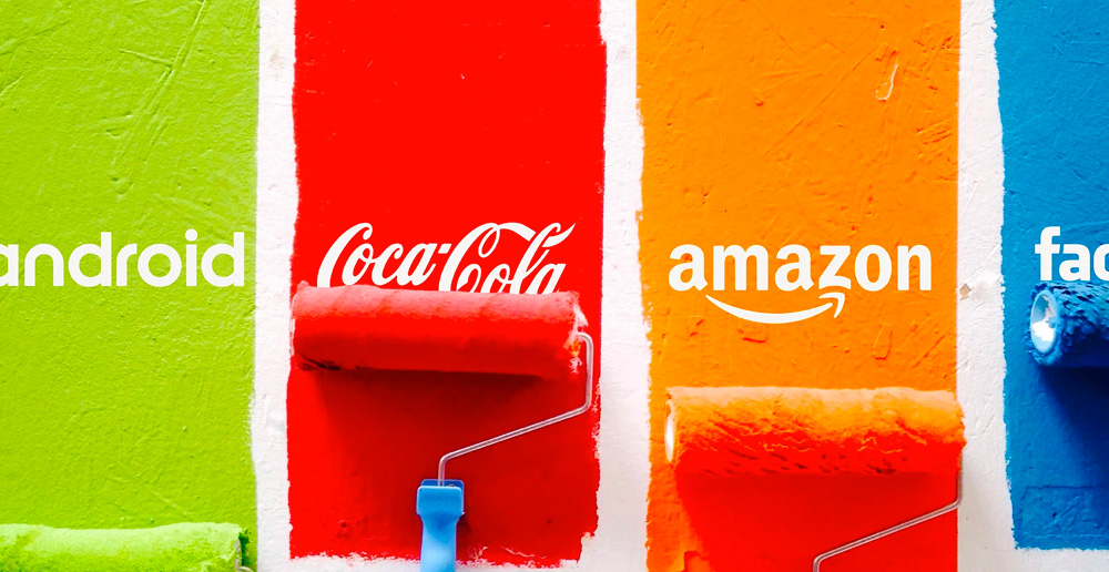
Are bold colours always a bold choice?
The association of colour with emotion seems to be a primal human response. If you ask most people what bold red represents to them, they’ll say passion or danger. Cool blue? Cool emotions.
Going bold with the colours in your design is a good way to catch the eye, but it is also an easy thing to do incorrectly. In your colour consideration, research the emotional associations of your pallette to have a very rough gauge of customer reactions, and make sure to use bold colours sparingly.
Brightness doesn’t have to be avoided altogether. There are spots where bold colours can be put to good use. Think about the design of a stop sign. Even in a busy world, the bright red of the sign contrasted with white text is eye-catching – just as it is supposed to be. You can use this strategy on your site to draw attention to calls to action. It’s particularly effective on buttons. Just remember that bright colours are very tiring to the eye and keep it simple on pages that require more reading time.
UX considerations: accessibility
Another overlooked area regarding colour is the basic issue of accessibility. Not everyone has the ability to see in full colour. During the design process, apply colour filters to check how the site is going to look to different people. There are many different types of colour blindness – you’ll find it’s much more complicated than simply avoiding red or green.
When looking at your design from an accessibility point, don’t forget to reconsider the emotional and cultural impact of your choices. You might find that a fresh green design looks washed-out and orange to people with certain types of colour blindness. With one in 12 men and one in 200 women affected, colour blind viewing is not something you can afford to ignore in your design.
A/B testing for better conversions
Thorough testing should be in place for your site as a basic – but while you’re at it, experiment with colour a little, too. You can perform very simple A/B testing on colour choices by altering the colour of your call to action buttons. By following these simple UX web design tips will help you improve better conversions throughout your website.
When you’re setting up your A/B tests, it can be a good idea to include some colour selections that you wouldn’t personally respond to or stray from the brand palette. The results may not be what you were expecting. In this area, just like other things concerning calls-to-action, it’s okay to break the rules a little. While your web designer’s heart may break a little, your digital marketing agency will be happy to see your conversion rates soaring. The increase in audience engagement will have a knock-on positive effect on your SEO.
Conclusion
Think of your website colours as a tool to help your users better interact with your web page and navigate their way through your content. The key to figuring out if your colours are impacting the UX in the right way, make use of user testing and A/B colour tests.
Looking to give your site a fresh splash of colour, and want the marketing results that should come with it? For more information get in touch with web design firm today and let us show you how effective the right colours can play out on your UX design.